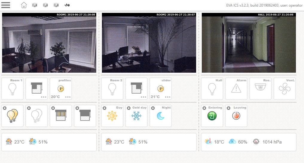
Dashboard page
Dashboard is usually a primary page of the interface.

Configuration looks like
#url: https://my.external.domain:port/
class: dashboard
title: Dashboard - Sample interface

default-login: operator

motd: >
  Default user name: <b>operator</b><br />
  Default password: <b>123</b><br />
  Demo source: <b><a href="https://github.com/alttch/eva-demo-smarthome">
    https://github.com/alttch/eva-demo-smarthome</a></b>

buttons:
  alarm:
    icon: attn
    item: lvar:security/alarm
    title: Alarm
  vent:
    title: Vent.
    icon: vent
    item: unit:equipment/vent
    busy: uuid

  window_room2:
    icon: window_right
    item: unit:windows/room2
    menu: 3

  lights_on:
    icon: lamps.s_1
    item: lmacro:control/lights_on

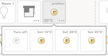
  thermo_room1_off:
    icon: thermostat.s_0
    title: Turn off
    action: unit:thermo/room1
    action_params:
      s: 0
  thermo_room1_15:
    icon: thermostat.s_1
    action: unit:thermo/room1
    title: "Set 15°C"
    action_params:
      s: 1
      v: 15
  thermo_room1_25:
    icon: thermostat.s_1
    action: unit:thermo/room1
    title: "Set 25°C"
    action_params:
      s: 1
      v: 25
  thermo_room1:
    icon: thermostat
    item: unit:thermo/room1
    value: "°C"
    title: profiles
    menu:
      - thermo_room1_off
      - thermo_room1_15
      - thermo_room1_20
      - thermo_room1_25
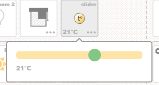
  thermo_room2:
    icon: thermostat
    item: unit:thermo/room2
    value: "°C"
    title: slider
    slider:
      min: 15
      max: 25
      step: 1
      can_off: true

  enter:
    title: Entering
    icon: enter.s_1
    item: lmacro:control/enter
  exit:
    title: Leaving
    icon: stop.s_1
    item: lmacro:control/exit


data:
  temp1_int:
    icon: indoor_temp
    item: sensor:env/temp1_int
    units: "°C"
    decimals: 0
  hum1_int:
    icon: indoor_hum
    item: sensor:env/hum1_int
    units: "%"
    decimals: 0
  pressure:
    icon: pressure
    item: sensor:env/air_pressure
    units: " hPa"
    decimals: 0

data-blocks:
  room1:
    size: medium
    elements:
      - temp1_int
      - hum1_int
    action: url:sensors.j2
  room2:
    elements:
      - temp2_int
      - hum2_int
    action: url:sensors.j2
  ext:
    elements:
      - temp_ext
      - hum_ext
      - pressure
    action: url:sensors.j2

cameras:
  room1:
    image: /rpvt?f=127.0.0.1:8118/cam/1?s=400x250&nocache=$NOCACHE
  room2:
    image: /rpvt?f=127.0.0.1:8118/cam/2?s=400x250&nocache=$NOCACHE
  hall:
    image: /rpvt?f=127.0.0.1:8118/cam/3?s=400x250&nocache=$NOCACHE


control-blocks:
  room1-controls:
    elements:
      - light_room1
      - window_room1
      - thermo_room1
  room2-controls:
    elements:
      - light_room2
      - window_room2
      - thermo_room2
  hall-and-svc:
    elements:
      - light_hall
      - alarm
      - cctv
      - vent
  macros:
    elements:
      - lights_on
      - lights_off
      - open_windows
      - close_windows
  profiles:
    elements:
      - day_mode
      - winterday_mode
      - night_mode
  enter-exit:
    elements:
      - enter
      - exit
layout:
  bar2:
    camera:
      id: room2
      reload: 1
    control-blocks:
      - room2-controls
      - profiles
    data-block: room2
  bar3:
    camera:
      id: hall
      reload: 1
      action: url:simple.j2
    control-blocks:
      - hall-and-svc
      - enter-exit
    data-block: ext
    #sys-block: true

layout-compact:
  elements:
    - { type: control-block, id: profiles }
    - { type: control-block, id: macros }
    - { type: control-block, id: enter-exit }
    - { type: camera, id: hall, reload: 2, action: "url:simple.j2" }
    - { type: data-block, id: ext }
    - { type: control-block, id: room1-controls }
    - { type: sys-block }
The page has dedicated compact layout for screens with width < 768 virtual or physical pixels (usually smartphones). Dedicated layout is used e.g. to slowdown camera refresh or to re-order control blocks.
On a dashboard page, everything is grouped into bars, one bar can have one camera, one data block, and any number of control blocks with buttons grouped by 4.
Usually 3-bar configuration is used, as it fits any display without scrolling and is very useful for the industrial computers, tablets and kiosks.
As dashboard is a primary page, let’s explain it as detailed as possible.
Global variables
title
If specified, set web page title.
url
External UI URL used in QR code for smartphone application setup. Set to document.location if not specified. If your setup uses front-end or clients access UI via port-forwarding on external IP/domain, variable must be present in config.
default-login
If specified, is used as a default user name for the login form.
motd
“Message of the day”. If present, will be shown on the login page.
info-level
Set to warning to disable info toasts (default is info).
data
In data section, sensor data is being displayed.
Data item looks like:
temp2_int:
  icon: indoor_temp
  item: sensor:env/temp2_int
  units: "°C"
  decimals: 0
  #action:
  #title:
  #timer: true
  #timer-max:
icon item icon (CSS class .eva_hmi_data_item.i_<icon_name>)
item EVA ICS item to display a chart for, usually a sensor, but can be unit or logical variable as well
units value units. As YAML doesn’t like special characters, should be quoted
decimals value decimals after comma
action for any data item, action can be defined
title element title
- timer if data item is lvar and this lvar is being used as a timer, you
may display its countdown, specifying timer: true
timer-max max time units displayed on timer. Default is hours, can be changed to minutes or seconds.
To be displayed, sensor data item must be included in a data block.
cameras
This section defines camera images. Camera image can be a link to a static camera image, uploaded by camera on a HTTP server, direct link to camera, links to camera proxy script, such as EVA SFA RPVT etc. If different camera resolutions are used in a different layouts, they may be listed with a different camera names (e.g. camera1_small, camera1_large).
room1:
  image: /rpvt?f=127.0.0.1:8118/cam/1?s=400x250&nocache=$NOCACHE
A special parameter $NOCACHE is used to prevent HTTP-caching and automatically replaced with current timestamp before the request.
For camera, on-click action, as well as reload speed can be defined. These parameters are set in the layout section, when camera is displayed.
control-blocks
All control buttons must be grouped in a control blocks. One control block can have up to 4 buttons.

A control block looks like:
room1-controls:
  elements:
    - light_room1
    - window_room1
    - thermo_room1
data-blocks
A data block groups data items and looks like:
room1:
  #size: medium
  #css-class: mycustomclass
  elements:
    - temp1_int
    - hum1_int
  #action: url:sensors.j2

size data block size (small, medium or large, default: small)
css-class custom data block CSS class
If on-click action is specified for the data block, it overrides actions, specified for the single data items.
layout
All items you want to be displayed, must be included in layout section. As it was already told, layout is split to bars. And bar section looks like:
bar1:
  camera:
    id: room1
    reload: 1
    action: url:simple.j2
  control-blocks:
    - room1-controls
    - macros
  data-block: room1
  #sys-block: true
Bar can have ID from 1 to 100 (bar1-bar100).
All parameters are optional. If sys-block parameter is specified and is true, system block (system info, evaHI setup, logout link) will be displayed at the bottom of the bar.

System block
layout-compact
If specified, used to display a dedicated layout for screens with width < 768 virtual or physical pixels (usually smartphones).
Looks like a simple list of elements need to be displayed:
layout-compact:
  elements:
    - { type: control-block, id: profiles }
    - { type: control-block, id: macros }
    - { type: control-block, id: enter-exit }
    - { type: camera, id: hall, reload: 2, action: "url:simple.j2" }
    - { type: data-block, id: ext }
    - { type: control-block, id: room1-controls }
    - { type: sys-block }
Actions
Action types
All buttons have the actions, data items, data blocks and cameras can have actions as well. Let’s explain what types of actions may be specified:
unit:id execute unit action (action or action_toggle)
lvar:id execute lvar set or toggle.
lmacro:id launch a macro
url:URL go to URL
javascript: execute JavaScript code via eval()
action_params
For items, action launches toggle action by default, however if action parameters are specified and status or value are present, it will launch action API call for units and set API call for logical variables. For macros, additional launch parameters can be specified.
Example:
buttons:

  #............
  #............
  #............

  thermo_room1_25:
    icon: thermostat.s_1
    action: unit:thermo/room1
    title: "Set 25°C"
    action_params:
      s: 1
      v: 25

