Gauge
React component. Provides a classical gauge visualization component.
If showValue parameter is used, the component additionally accepts all parameters of ItemValue.
Example
import { Gauge, GaugeType } from "@eva-ics/webengine-react";
const MyComponent = () => {
return (
<>
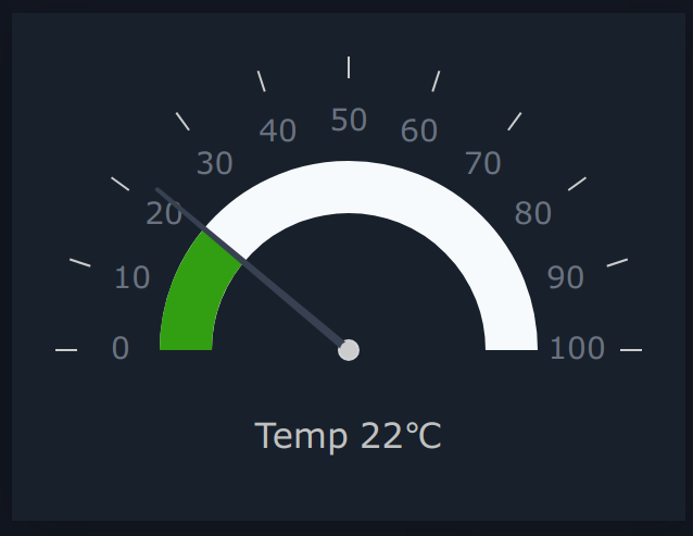
<Gauge
type={GaugeType.Light}
oid="sensor:tests/temp"
minValue={0}
maxValue={100}
critValue={70}
warnValue={40}
diameter={250}
units="℃"
showValue
label="Temp"
/>
</>
);
};
Parameters
name |
type |
required |
description |
|---|---|---|---|
minValue |
number |
yes |
Minimum value |
maxValue |
number |
yes |
Maximum value |
oid |
string |
no |
item OID |
state |
ItemState |
no |
item state |
label |
string |
no |
Bottom label |
showValue |
boolean |
no |
Display item value |
formula |
string |
no |
value modification formula e.g. “x/1000” |
digits |
number |
no |
round digits after comma |
type |
GaugeType |
no |
Gauge type |
diameter |
number |
no |
Gauge total size |
warnValue |
number |
no |
Gauge warning upper threshold |
critValue |
number |
no |
Gauge critical upper threshold |
lowWarnValue |
number |
no |
Gauge warning lower threshold |
lowCritValue |
number |
no |
Gauge critical lower threshold |
startAngle |
number |
no |
Starting angle |
endAngle |
number |
no |
Ending angle |
numTicks |
number |
no |
Number of ticks |
offset |
number |
no |
Gauge progress offset |
arcStrokeWidth |
number |
no |
Arc width |
strokeLineCap |
GaugeStrokeLineCap |
no |
Arc stroke ending |
tickLength |
number |
no |
Length of ticks |
baseRadius |
number |
no |
Base radius |
tipRadius |
number |
no |
Tip radius |
middleRadius |
number |
no |
Middle radius |
needleOffset |
number |
no |
Needle offset |
engine |
Eva |
no |
WebEngine object (if no default set) |
Types
GaugeType
enum GaugeType {
  Standart = "standard",
  Modern = "modern",
  Sphere = "sphere",
  Minimal = "minimal",
  Light = "light"
}
GaugeStrokeLineCap
enum StrokeLineCap {
  Butt = "butt",
  Round = "round",
  Square = "square",
  Inherit = "inherit"
}
CSS classes
name |
description |
|---|---|
.gauge-container |
the primary container |
.gauge-wrapper |
gauge wrapper layer |
.gauge-preview |
gauge svg layer |
.gauge-value |
gauge value (if displayed) |
.gauge-label |
gauge label (if set) |
.gauge-progress-background-color |
the default arc background color |
.gauge-text-default-color |
the default text color |
.gauge-middle-base-color |
middle base color |
.gauge-midpoint-color |
middle point color |
.gauge-tick-color |
tick color |
.gauge-needle-color |
needle color |
.gauge-progress-color |
the default arc color |
.gauge-warning-progress-color |
warning color |
.gauge-critical-progress-color |
critical color |
gauge-label-circle |
label in “modern” gauge |
gauge-value-result |
value in “modern” gauge |
CSS Example
.gauge-container {
  display: flex;
  flex-direction: column;
  align-items: center;
  justify-content: center;
}

.gauge-wrapper {
  display: flex;
  align-items: center;
  justify-content: flex-start;
  flex-direction: column;
  box-shadow: 4px 4px 20px 0px rgba(10, 10, 10, 0.24);
  padding: 20px;
}

.gauge-preview {
  max-width: 100%;
  overflow: visible;
}

.gauge-value {
  margin-top: 30px;
  font-size: 1rem;
  font-weight: 500;
  fill: #6b7280;
  display: flex;
  align-items: center;
  justify-content: center;
}

.gauge-label {
  font-weight: normal;
  margin-right: 5px;
}

.gauge-progress-background-color {
  stroke: #f7fafc;
}

.gauge-text-default-color {
  user-select: none;
  font-size: 0.875rem;
  font-weight: 500;
  fill: #6b7280;
}

.gauge-middle-base-color {
  fill: #d1d5db;
}

.gauge-midpoint-color {
  fill: #ccc;
}

.gauge-tick-color {
  stroke: #ccc;
}

.gauge-needle-color {
  fill: #374151;
}

.gauge-progress-color {
  stroke: #50c878;
}

.gauge-warning-progress-color {
  stroke: #f0e130;
}

.gauge-critical-progress-color {
  stroke: #e32636;
}

.gauge-label-circle {
  position: absolute;
  font-size: 20px;
  font-weight: bold;
  color: #c1c1c1;
  top: 45%;
  margin: 0;
}

.gauge-value-result {
  position: absolute;
  font-size: 16px;
  color: #c1c1c1;
  bottom: 35%;
  margin: 0;
}