ProgressBar
Contents
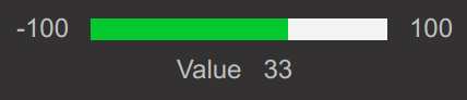
React component. Provides a horizontal progress bar visualization component.
If showValue parameter is used, the component additionally accepts all parameters of ItemValue.
Example
import { ProgressBar } from "@eva-ics/webengine-react";
const MyComponent = () => {
return (
<>
<ProgressBar
oid="sensor:tests/temp"
minValue={0}
maxValue={100}
critValue={70}
warnValue={40}
units="℃"
showValue
label="Temp"
/>
</>
);
};
Parameters
name |
type |
required |
description |
|---|---|---|---|
minValue |
number |
yes |
Minimum value |
maxValue |
number |
yes |
Maximum value |
oid |
string |
no |
item OID |
state |
ItemState |
no |
item state |
formula |
string |
no |
value modification formula e.g. “x/1000” |
digits |
number |
no |
round digits after comma |
label |
string |
no |
Bottom label |
showValue |
boolean |
no |
Display item value |
warnValue |
number |
no |
Progress bar warning upper threshold |
critValue |
number |
no |
Progress bar critical upper threshold |
lowWarnValue |
number |
no |
Progress bar warning lower threshold |
lowCritValue |
number |
no |
Progress bar critical lower threshold |
showMinMax |
number |
no |
Show min/max tick labels |
engine |
Eva |
no |
WebEngine object (if no default set) |
CSS classes
name |
description |
|---|---|
.eva-progressbar-container |
the primary container |
.eva-progressbar-progress-container |
the bar container |
.eva-progressbar-labels-container |
ticks container |
.eva-progressbar-min-value |
min. value tick label |
.eva-progressbar-max-value |
max. value tick label |
.eva-progressbar-values-container |
label/value container |
.eva-progressbar-label |
label class |
.eva-progressbar-progress-color |
the default bar color |
.eva-progressbar-warning-progress-color |
warning color |
.eva-progressbar-critical-progress-color |
critical color |
CSS Example
.eva-progressbar-container {
  position: relative;
  width: 100%;
  display: flex;
  align-items: center;
  justify-content: center;
  flex-direction: column;
  gap: 5px;
}

.eva-progressbar-labels-container {
  display: flex;
  align-items: center;
  width: 100%;
  gap: 10px;
}

.eva-progressbar-progress-container {
  position: relative;
  display: flex;
  gap: 10px;
  width: 100%;
  height: 10px;
  background-color: #F3F3F3;
}

.eva-progressbar-min-value,
.eva-progressbar-max-value {
  color: #c1c1c1;
  font-size: 12px;
  font-style: normal;
}

.eva-progressbar-values-container {
  display: flex;
  align-items: center;
  justify-content: center;
  gap: 10px;
  color: #c1c1c1;
}

.eva-progressbar-values-label {
  margin: 0;
}

.eva-progressbar-progress-color {
  background-color: #02CA2E;
}

.eva-progressbar-warning-progress-color {
  background-color: #F19F00;
}

.eva-progressbar-critical-progress-color {
  background-color: #E71B21;
}